
A complete visual identity for a podcast that makes cutting-edge university research feel as approachable as a conversation with a friend.
overview
Arizona State University's Knowledge Enterprise produces some of the most compelling research in the country but research rarely speaks for itself.
Lab Coat Optional was created to bridge that gap: a podcast for curious, everyday listeners who don't need a PhD to be fascinated by science. The design challenge was to honor ASU's institutional brand while shedding its academic weight.

01
Brand alignment
Rooted in ASU's visual identity (gold, black, and bold typography) but loosened from institutional formality.
02
scalable system
Dozens of researchers, topics, and episodes demanded a flexible design system that scales without losing cohesion.
03
Personality
forward
The host's bright, playful character was a core design input, not an afterthought. The visuals needed to reflect his enthusiasm.
-
The starting point was understanding who the show was actually for and who was hosting it. Conversations with the host, the writing team, and the video team revealed a persona that was curious, energetic, and a little irreverent. That became the emotional brief for every visual decision that followed.
-
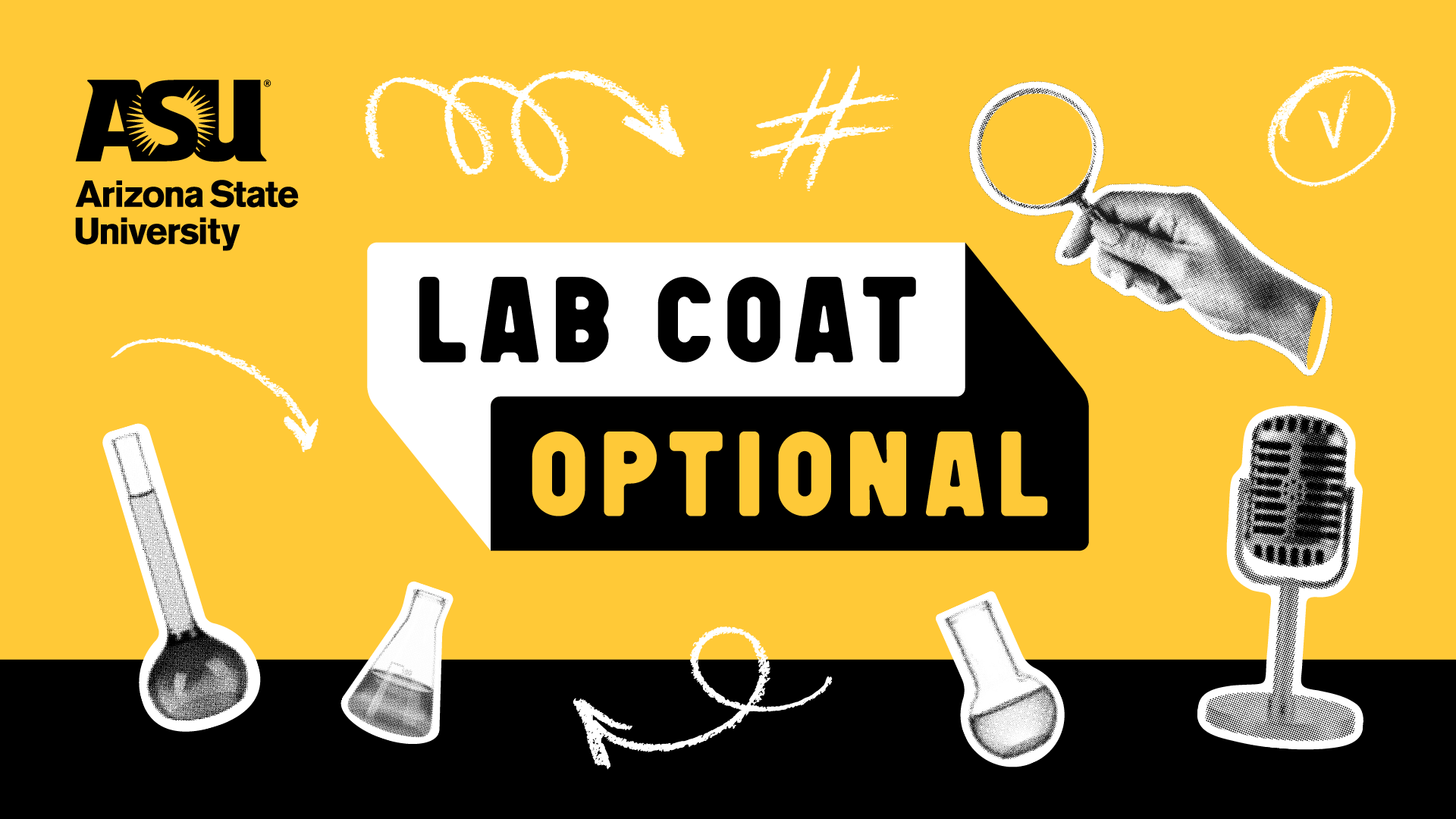
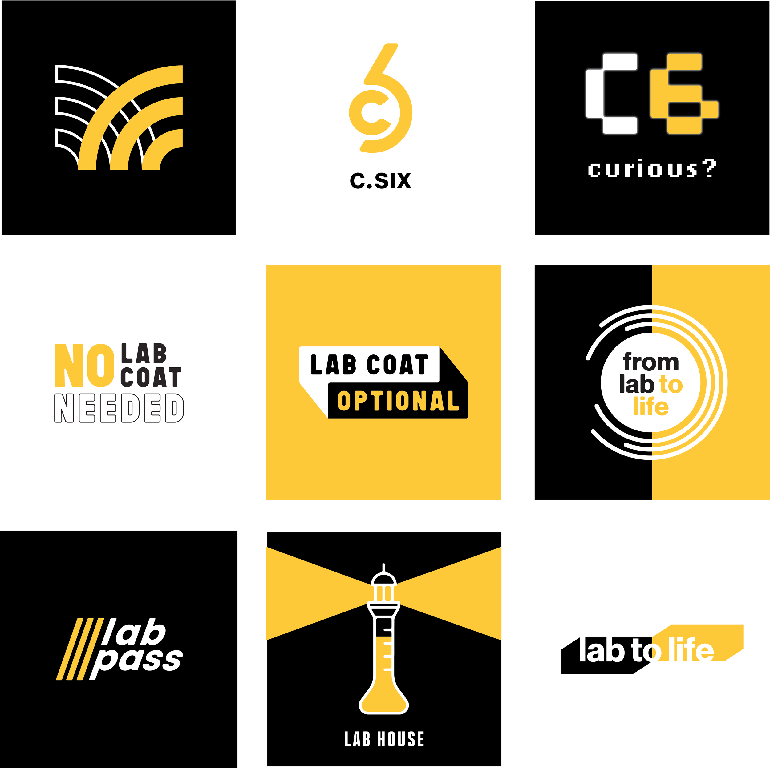
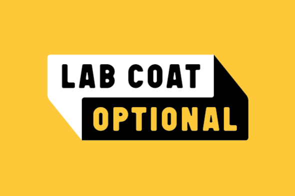
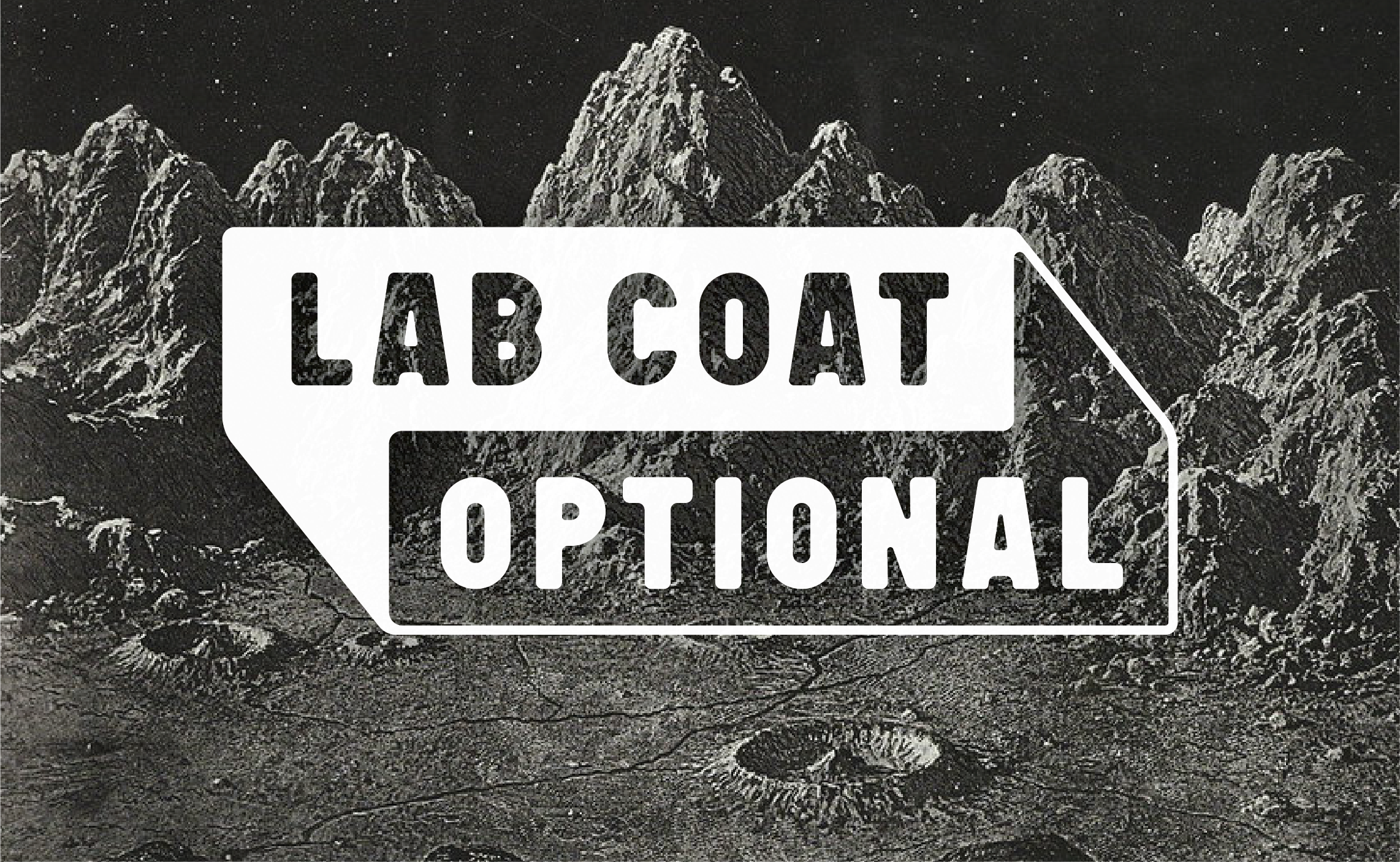
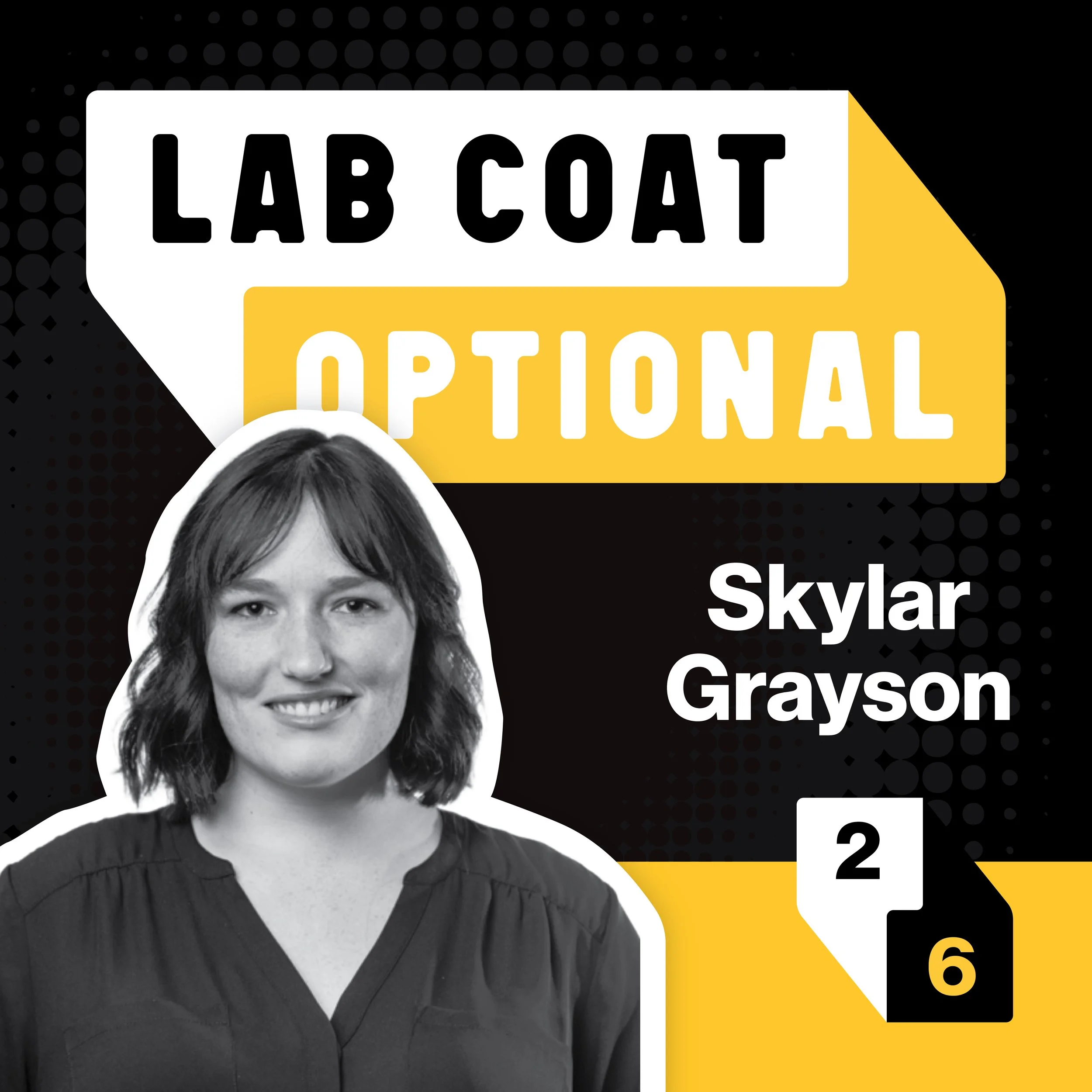
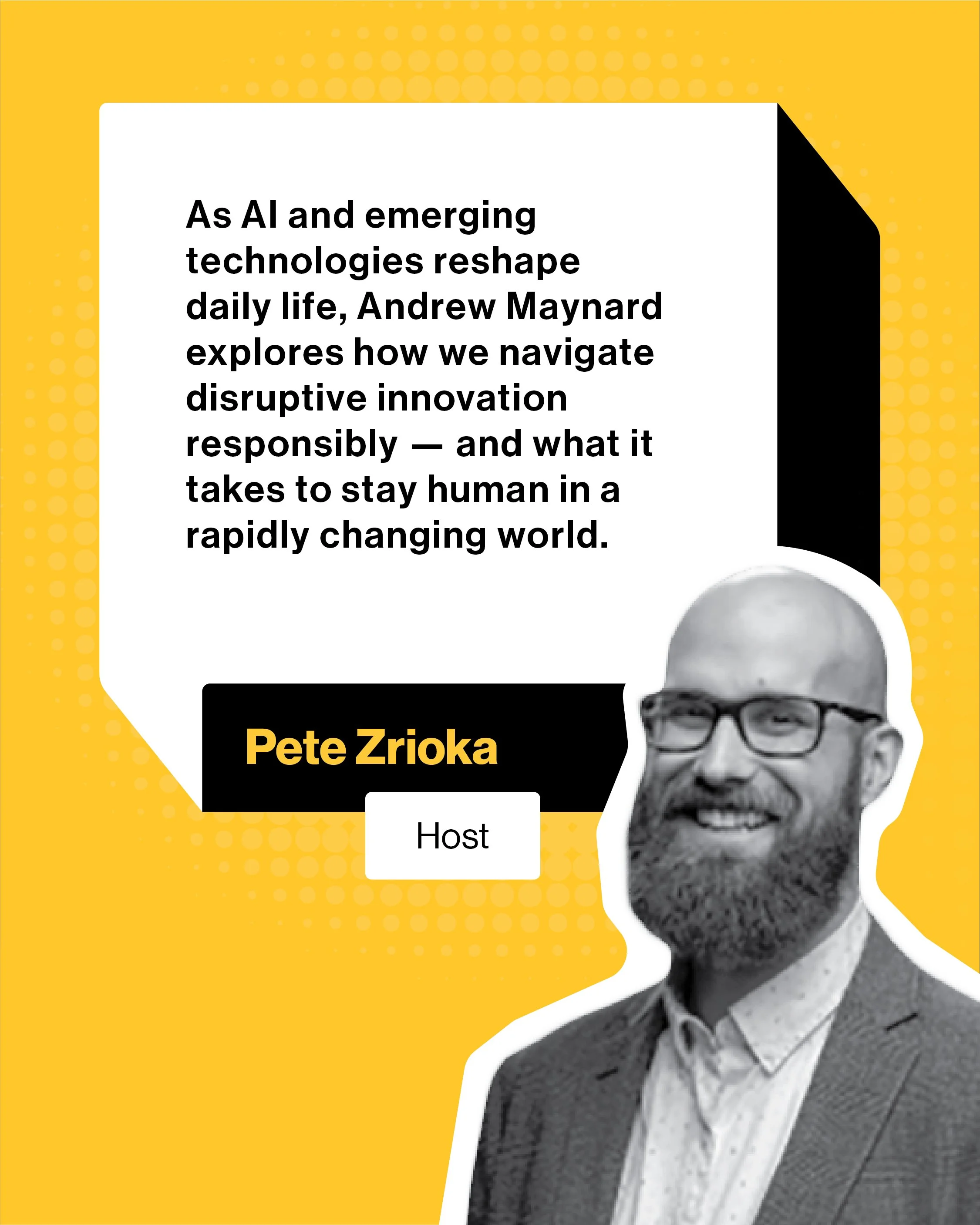
The wordmark needed to feel bold and confident without taking itself too seriously. The two-block stacked treatment, "LAB COAT" in heavyweight condensed type on white, "OPTIONAL" reversed on gold, creates instant hierarchy and brand recall. A clipped corner adds a casual, conversational shrug to the mark, nodding to the show's name.
-
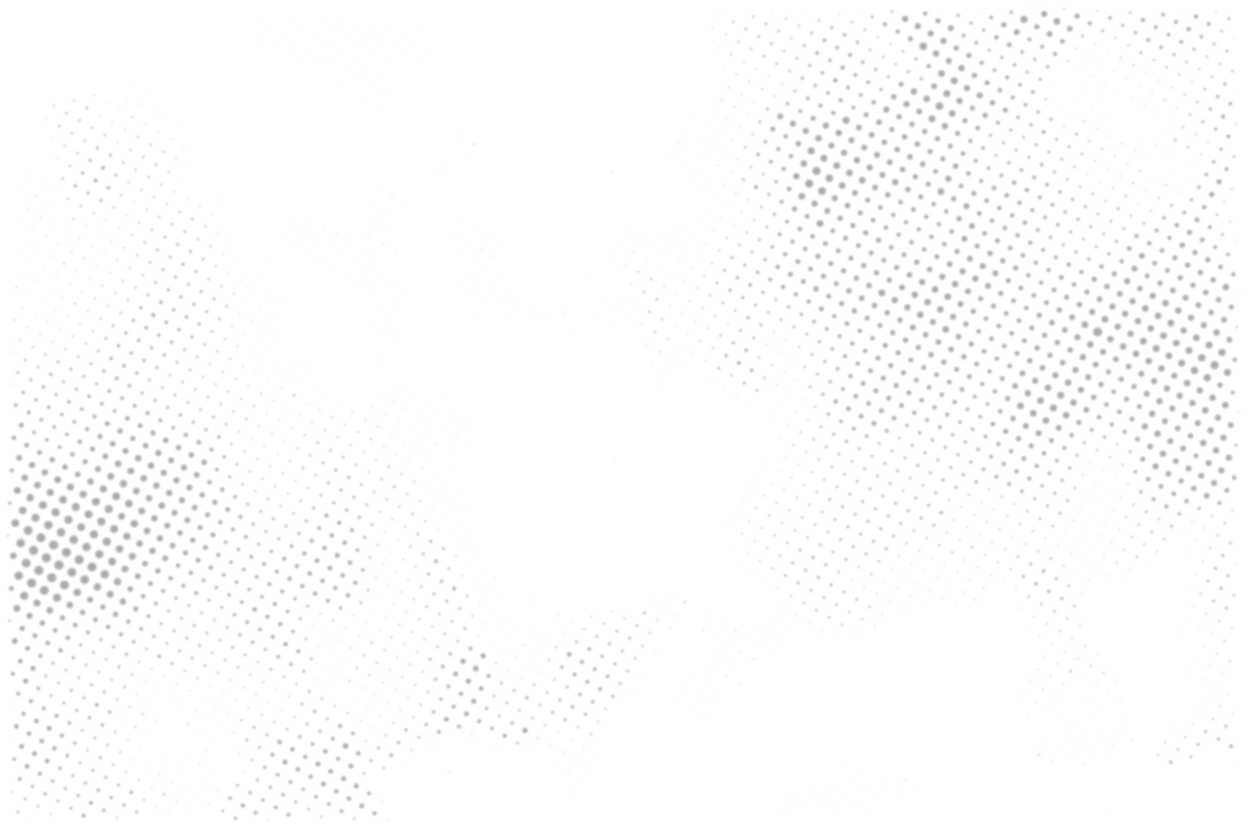
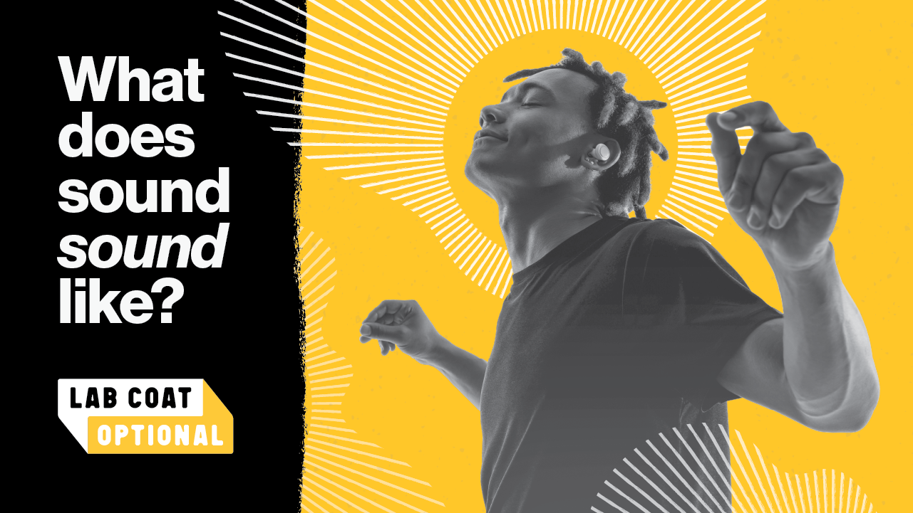
With a wide-ranging roster of researchers — each episode covering a different field, a different guest, a different idea — a rigid template would break quickly. The solution was a collage-based design system: halftone photography, cut-out textures, hand-drawn arrows, and episode-specific imagery layered onto a consistent black-and-gold foundation. Each episode feels fresh while remaining unmistakably Lab Coat Optional.
-
Design doesn't happen in isolation. Iteration happened alongside the host, video production team, and writers — each bringing their own perspective on how the show should feel. That feedback loop shaped everything from type sizing on thumbnails to the poster's cinematic composition.
process
DELIVERABLES
the final logo
The wordmark anchors the entire system. Condensed, bold, and two-toned, it works at any size and in any context, from a social thumbnail to a stage banner.
Two interlocking speech bubbles represent our host and guest locked in conversation. The clipped-corners subtly communicate the show's relaxed spirit. The offset stacking creates visual movement without instability. No color? No problem. Tiny browser tab version? Bases covered:

episode art system
Each episode gets a full suite of assets: an episode cover image, a YouTube thumbnail, and a carousel optimized for various social platforms. The collage system means every episode is visually distinct — built around its specific guest and topic — while remaining instantly recognizable as part of the show.


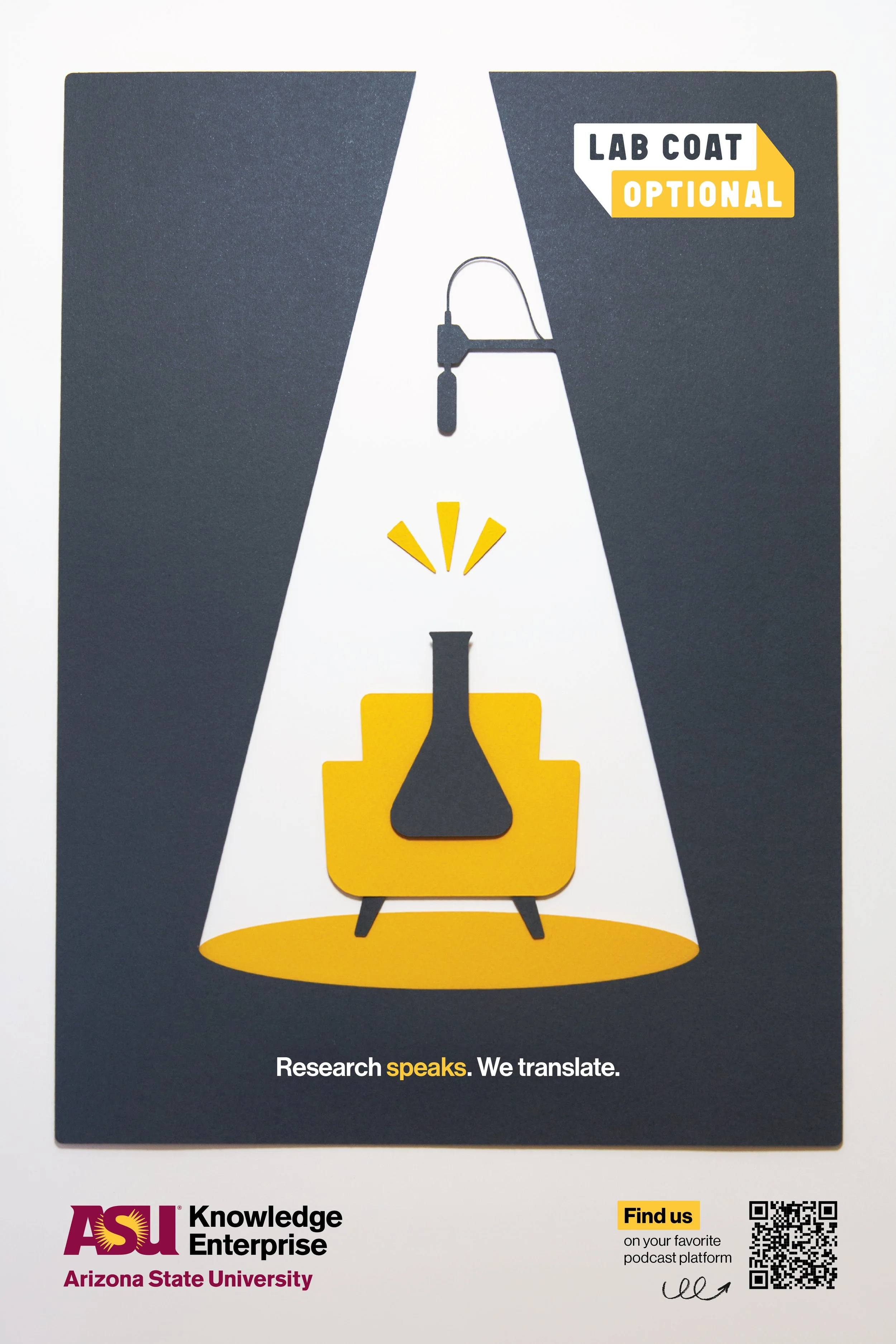
The poster
A minimal poster designed for physical displays on campus. A retro-futurist mid-century sensibility positions the podcast as something inviting and a little theatrical.
The paper cut-outs add handmade warmth while staying on-brand. The tagline "Research speaks. We translate." anchors the show's entire mission in six words.
Conclusion
Lab Coat Optional launched in August 2025 and continues to grow as a home for curious minds who want research without the jargon. What started as a quick cubicle convo became a full visual system — logo, poster, episode art, social graphics, and beyond — designed to be as versatile as the show itself. If you're curious what it sounds like when science gets comfortable, go give it a listen: