

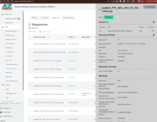
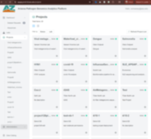
a visual system designed to match a platform users already know and scale outward from there
background
APGAP is a multi-institution data platform for pathogen genomics, stewarded jointly by Arizona's three state universities, TGen North, and the state health department. It tracks viral, bacterial, and fungal pathogens.
Despite its reach, APGAP had no consistent visual language. My job was to build one — something that could live alongside the platform's existing interface, work across a coalition of institutional partners, and still feel cohesive and purposeful at every scale.
#2AD6A2
#007C57
#F3F4F6
#DCDDDF
#565A61
#191919
the colors
I extracted the exact colors already present in the APGAP platform UI. The result is immediate visual continuity: when a user logs in from the website, they're already in familiar territory.
The green is used sparingly — reserved for primary actions, just as it is inside the platform. Most of the site's color comes from photography: Arizona landscape imagery to bring warmth, and technical photography to reinforce the subject matter. That keeps the brand flexible as APGAP grows.


THE LOGO
It works in teal on dark backgrounds and full color on light, maintaining clarity and contrast at each extreme. The lockup system offers a few configurations: horizontal, stacked, one paired with the expanded acronym, and a small version for browser tabs and social icons, no microscope required. It was designed to flex across every context without losing its character.
The wordmark is intentionally set in all lowercase. Acronyms in capitals invite the eye to read each letter in isolation — A, P, G, A, P — which fragments the name and makes it feel bureaucratic. Lowercase pulls in the opposite direction, treating "apgap" as a single continuous word and guiding anyone encountering the brand for the first time toward the correct pronunciation. More on the icon below:
One Mark.
Four Meanings.
The icon encodes the full name of APGAP into a single, compact form. Every element earns its place — there is nothing decorative here. The result is what I'd call a visual acronym: a mark that rewards close reading but works just as well at a glance.

ARIZONA

The radiating rays at the crown of the icon reference the Arizona sun, grounding the platform in its geographic home and giving the mark warmth and energy that a purely clinical symbol would lack.
pathogen genomics

The horizontal extensions evoke a pathogen's surface structure — exaggerated protein spikes that make the subject matter legible to a scientific audience without feeling heavy-handed to anyone else.
Analytics

The central circle reads as a lens — a universal shorthand for scrutiny, investigation, and insight. Familiar as a symbol, but fully integrated into the form rather than applied on top of it.
Platform
Inward-pointing arrows at the base suggest convergence — a hub where distributed research comes together. It communicates the platform's core function: bringing data and researchers into one place.
Tested everywhere it will actually live:

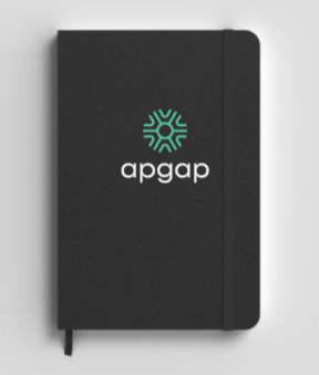
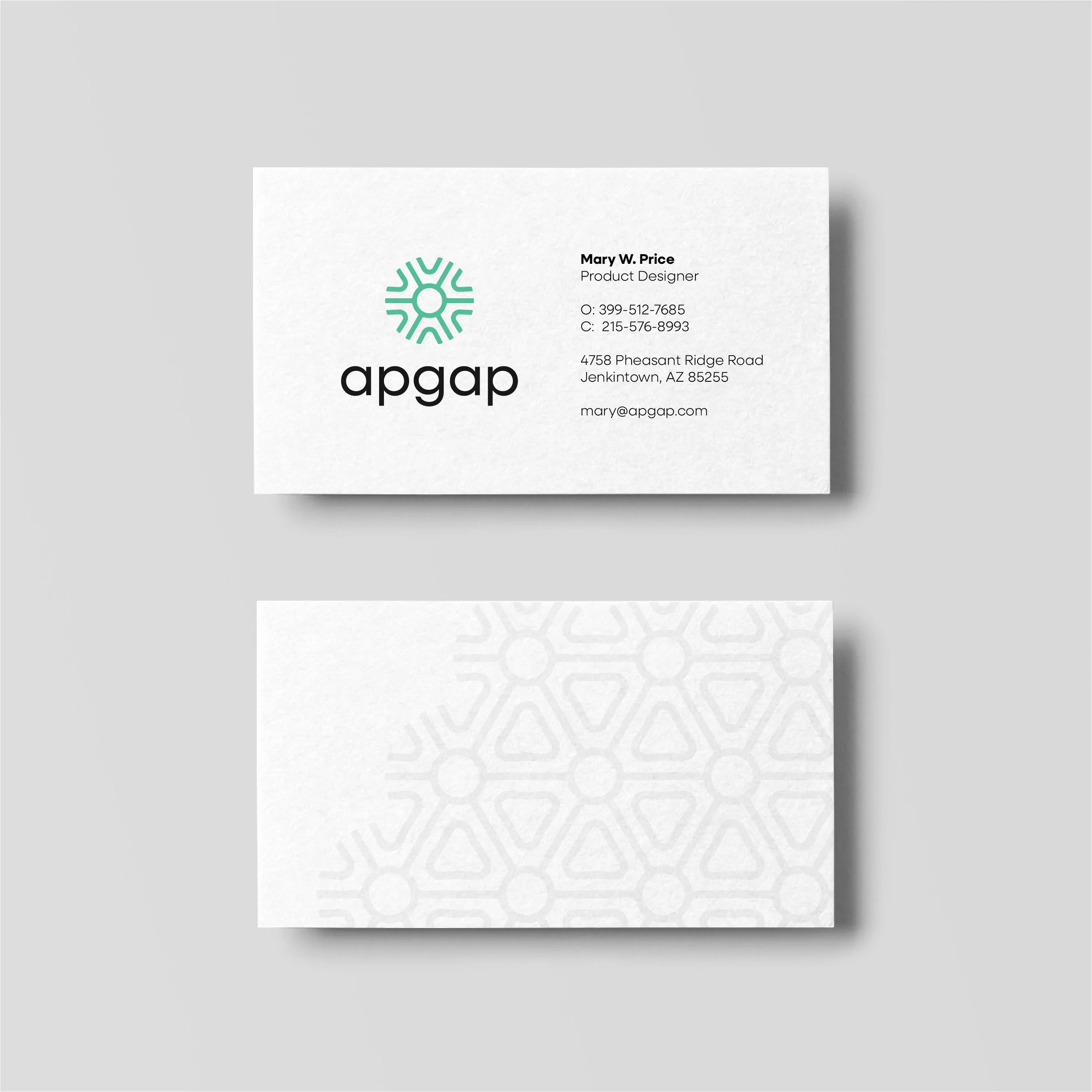

The t-shirt and notebook can be used for both internal team use and public-facing health events. Business cards front and back, with a subtle watermark treatment. The pen proves legibility at the smallest sizes — critical for lanyards, lip balm, and other small swag.
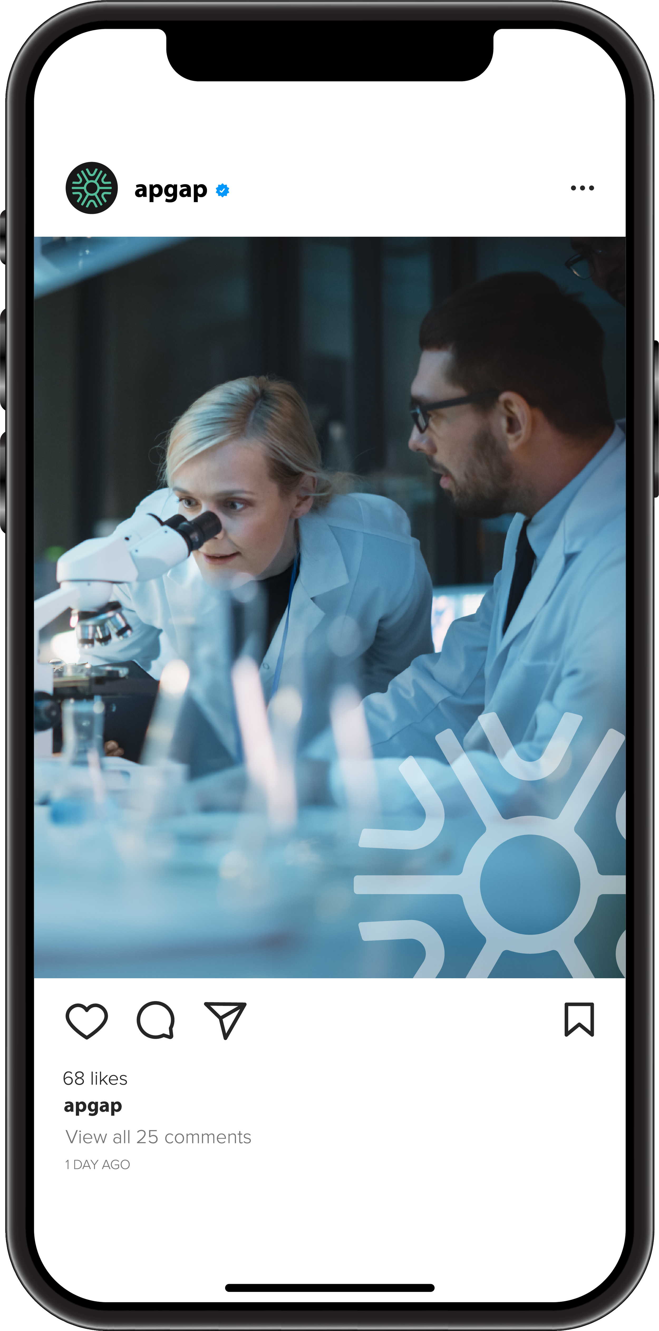

The APGAP icon doubles as a watermark overlay on photography — anchoring scientific imagery to the brand on social media and across the site without overpowering it. On web backgrounds, the icon tiles into a subtle repeating pattern that adds visual texture while keeping the palette clean and content-forward. These same building blocks informed a broader set of custom icons designed specifically for the website. More on that below:
Each capability on the APGAP website is paired with a custom-drawn icon — designed in the same line-weight and visual language as the APGAP mark itself. The result is a cohesive set that communicates complex scientific functions at a glance, without relying on generic stock imagery.
custom icons


Data Standardization
Data Analysis

Collaboration

Security

Provenance
Conclusion
From a palette rooted in the platform users already know, to a logo that encodes the organization's full name in a single mark, every decision in this project was made to serve APGAP's mission — not just its aesthetics. The brand system is built to scale: coherent at favicon size, flexible enough to grow with new partners and program areas, and purposeful enough to earn trust with researchers, health officials, and the public alike. The result is an identity as rigorous as the science it represents.